Area Analysis
Visualyse Interplanetary includes a powerful feature for area analysis that is both quick and simple to use.
Area Analysis allows you to produce colour coded block plot or contours of Link or Station parameters and of the statistics of these parameters.
In outline, you simply define the area you are interested in and Visualyse Interplanetary will ask for a template Link (or Station) to use as a test probe at every point (down to a user defined resolution) within the area to work out the parameter you want to analyse.
There is also an alternative method called “Advanced Contouring” to produce contours using groups of stations and links as described in the last sub-section.
Creating the Analysis
Area analysis is started by selecting ‘Create and Area Analysis’ from the Results menu or clicking the ![]() icon on the toolbar, or by selecting the Area Analysis Manager from the Results menu.
icon on the toolbar, or by selecting the Area Analysis Manager from the Results menu.
The simplest way to create a new Area Analysis is to click the icon - you can then draw out the area on the map using the mouse. Drag the mouse from the top left to the bottom right of the area of interest.
When you release the mouse you will be prompted to select a Link to use as your template, and will have to select the parameter to analyse, as in the figure below.
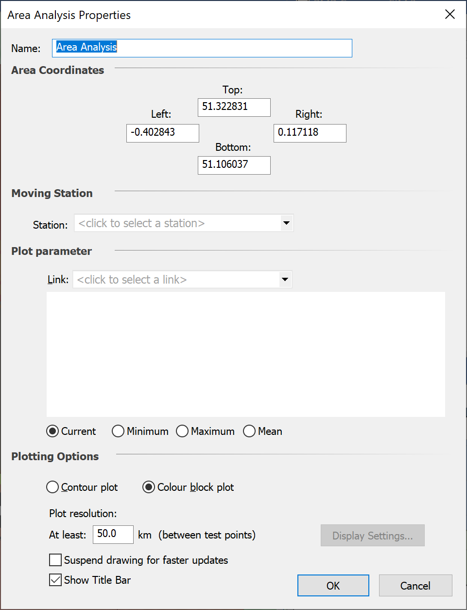
The Area Analysis properties page has the following parameters:
- Name
- Coordinates – if you have defined the area by drag and drop, the coordinates of the corners will be shown here and can be edited
- Moving station – one station must move in over the defined area. If you are looking at something like coverage analysis, this Station will be the receive station. If you are looking at interference levels it would be victim station. If you are looking at exclusion zones, it would probably be the interfering station.
- Plot parameter – select here the variable to be displayed in the Area Analysis for each location of the moving station
- Adjustment during run – this allows the field to display to take account of the simulation run, so that either the value for the current time step at each time step is shown or the min / max / mean over all time steps at each point is shown.
- Plotting options – as described in the following section
- Control to suspend drawing at each simulation update (including time step) to improve performance
- Control to suspend drawing of the Area Analysis title bar.
You can re-size the Area Analysis by clicking on the “Select Mode” icon on the toolbar and then dragging and dropping one of the corners or edges of the Area Analysis Rectangle.
Area Analysis Plot Options
You can plot the area analysis as a grid of coloured blocks (block plot) or as a series of contours (contour plot). Examples of these are shown below.
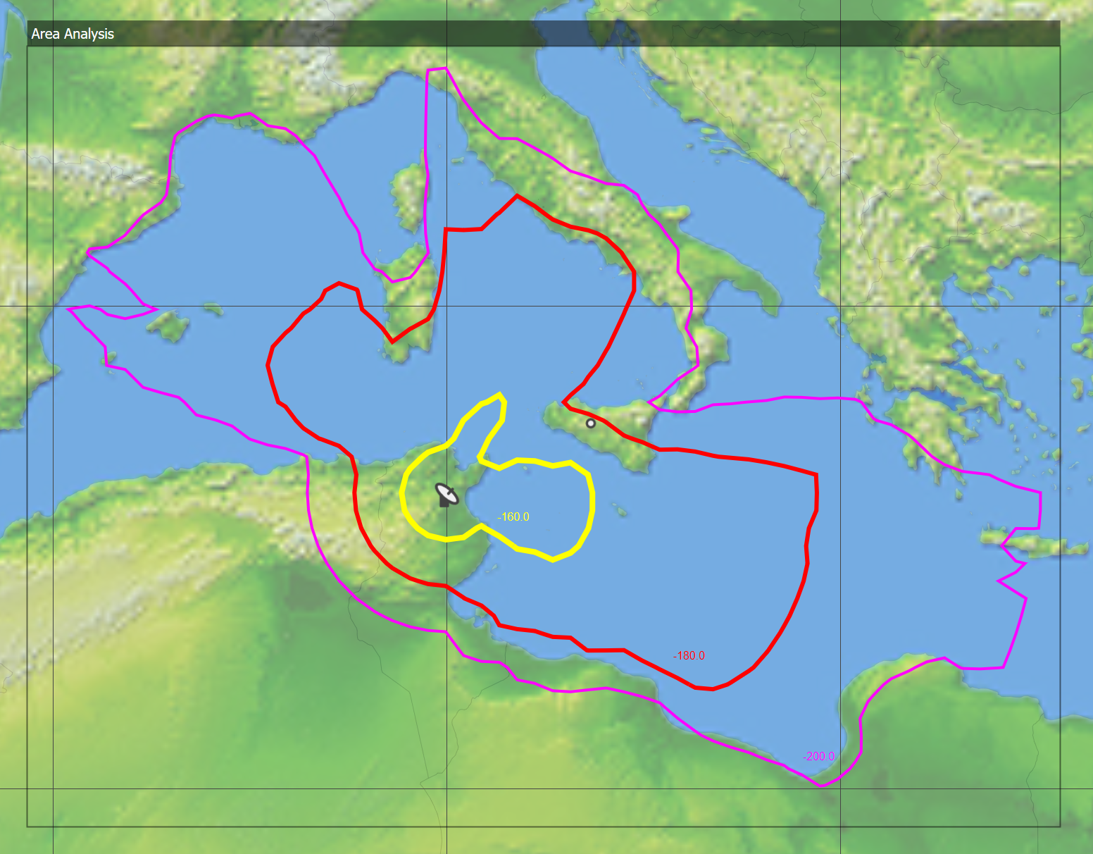
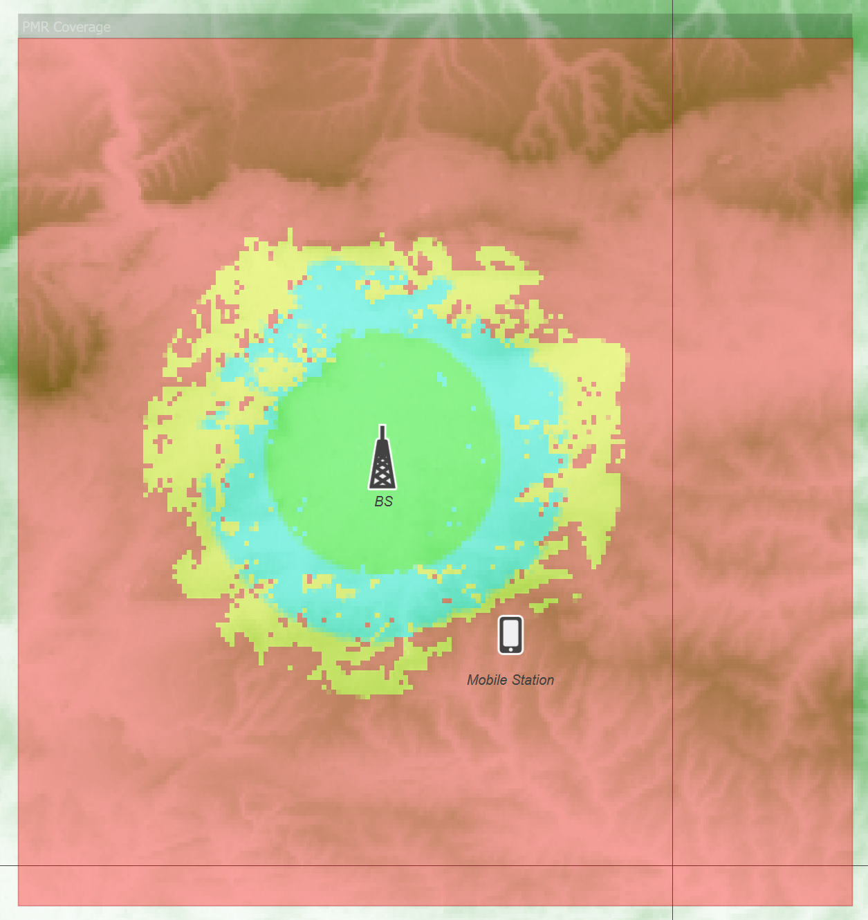
The number of kilometres between test points defines the resolution of the analysis. You can set this from the dialog.
Display Settings
The display settings depend on the type of plot you select.
Block Plot Display Settings
A block plot shows the variation in the chosen link parameter by plotting a block of colour at each test point. The display settings allow you to determine how the blocks are coloured, what ranges to plot and how the plot is rendered. The Display Settings dialog is shown below.
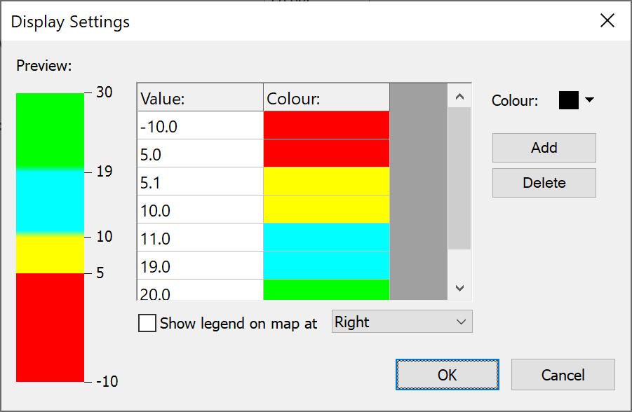
You can press the ‘Add’ button to add new levels and then:
- Type in the value in the first column
- Select the colour from the colour select control at the top right.
The left side of the dialog shows a preview of how the colours will appear on your plot. Calculated results between value entries in the table will result in a colour blended between the nearest two colour entries.
There is also a field to enable display of a legend on the map offset to one side of the Area Analysis, as in the figure below showing example file “PMR Coverage” from the “Network Coverage” example files.
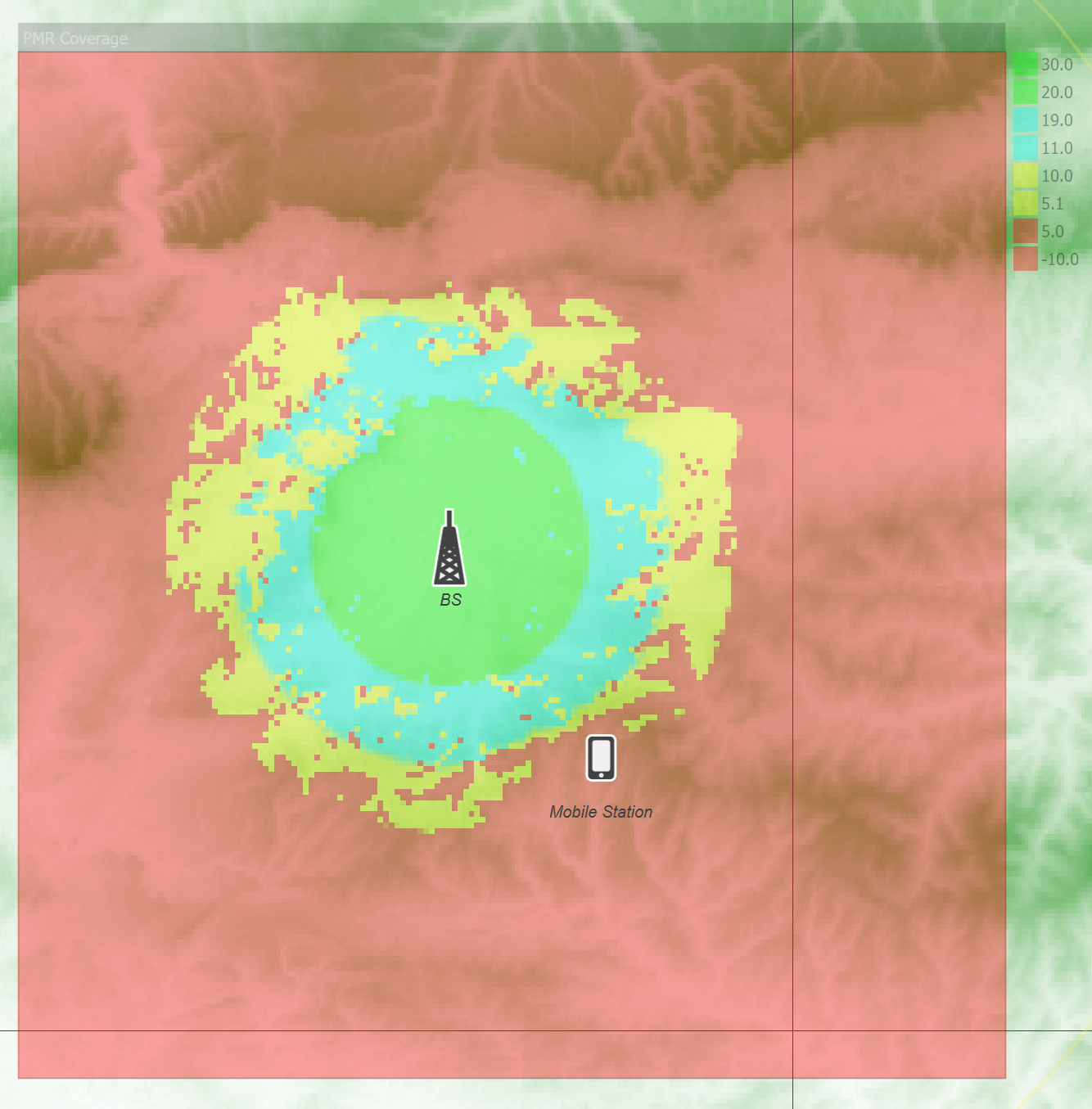
Colour Selection Tip 1: to create a map from ranges of values to a single colour, include two entries, one for the start and end of the required range. So in the example above yellow is used for C/Ns between 5 and 10. The first is offset slightly to 5.1 so it is greater than the end of the previous range, which is that C/Ns between -10 and 5 should be in red.
Colour Selection Tip 2: it is possible, and often useful, to set colour as “Don’t draw”. This can be useful to show in colour where criteria such as coverage is met and no colour where there is no coverage.
Contour Display Settings
Contour plots show the variation of the link parameter across the area as a set of contours. Because there are only a discrete number of contours, you can set their levels and colours individually. The display settings dialog for contour plots is shown below.
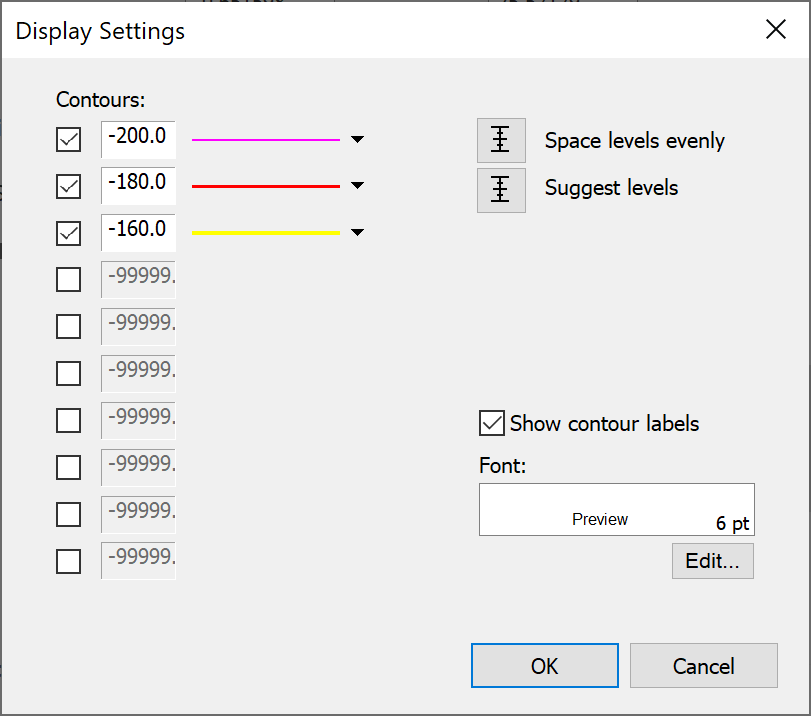
You can show up to ten different contour levels on your plot. These are shown on the left of the dialog. To set the level for a particular contour, simply enter a value for it in the appropriate box.
To change the line style or colour of a particular contour, click on the line style control.
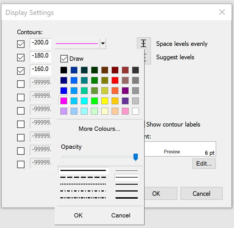
You can switch off contours by clicking on the appropriate check boxes.
If you want to display several contours between two levels, set the top and bottom contour levels to the extreme values and click “Space levels evenly” to automatically set the levels for the contours in between.
If you are not sure what the likely range of values will be in your plot, click “Suggest levels”. This will establish the likely range of values and fill in the contour levels with suitable values.
You can choose whether to show a label for each contour. The font for the contour labels can also be changed.
You can save your contour settings as schemes for use another time. A number of schemes are supplied with the software. The values at the levels are not saved as these are highly dependent on the individual plot.
Area Analysis Pop-Up Menu
There are additional controls in a pop-up menu: to activate this right click on the Area Analysis.
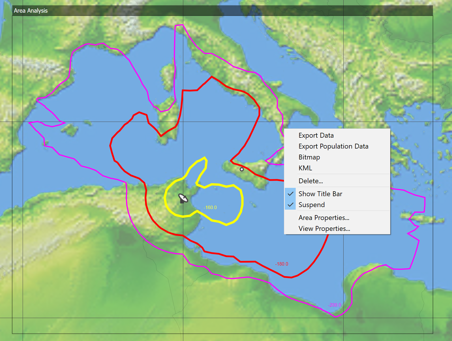
This gives additional options for the Area Analysis including:
- Export data: save the data as a comma separated values (CSV) text file for additional analysis
- Export population data: save in CSV format the population associated with each of the contour or threshold levels defined under Area Properties. This requires the population data directory be set as in Population Data Settings
- Bitmap: saves the image produced by the Area Analysis as a bitmap
- KML: exports data from the simulation including the Area Analysis to be displayed in Google Earth (see Interface to Google Earth)
- Delete: deletes the selected Area Analysis
- Suspend on/off: stops re-calculation of the Area Analysis every time the simulation is updated. This is useful for calculations that take a long time to complete. Remember to un-suspend to show the results!
- Area Properties: opens the Area Analysis configuration dialog as described in Creating the Analysis
- View Properties: opens the view configuration dialog as described in Map View
Tip: It is often useful to create Area Analysis that do not completely overlap so that it is possible to right click on each to open this list of options. However remember the Area Analysis Manager (see following section) can be used to open the properties of any Area Analysis – even those covered by others.
Area Analysis Management and Display
All the Area Analysis defined for the current simulation can be accessed via the Area Analysis list, accessed via the Results menu option “Area Analysis Manager”.
The dialog allows control on the Area Analysis, including buttons to:
- Add
- Edit
- Delete
- Duplicate
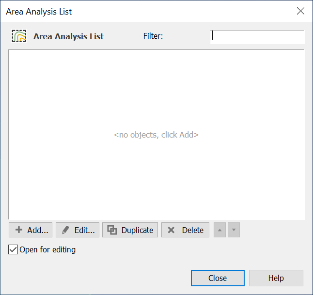
Any of the Area Analysis can be shown on any map or 3D view where they are controlled via the overlays tab on the view properties: see Overlays for more information.
Advanced Contouring using Groups
This section describes an alternative way to generate contours using a grid of stations and associated links.
It is accessed via the properties dialog of:
- Map Views (Mercator or Plate Carrée)
- 3D View
On the view properties dialog on the first or “Features” tab there is an “Options” button under “Advanced Contouring”. If you click on this you will be able to configure the contours using the following two pages:
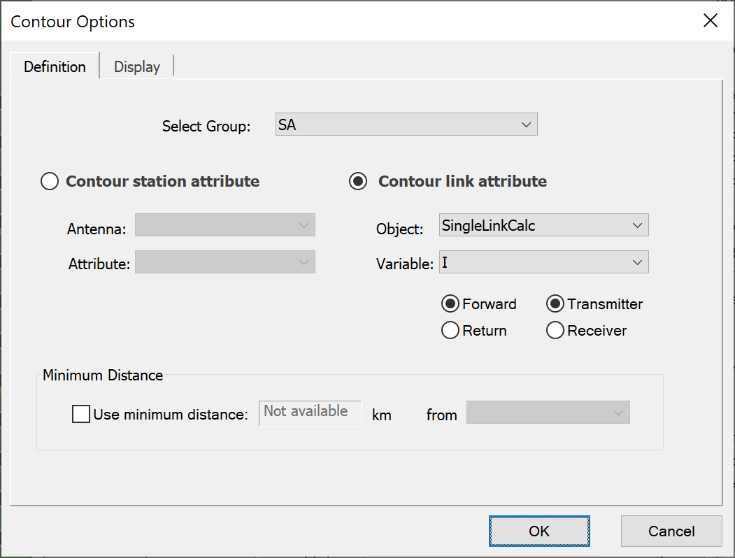
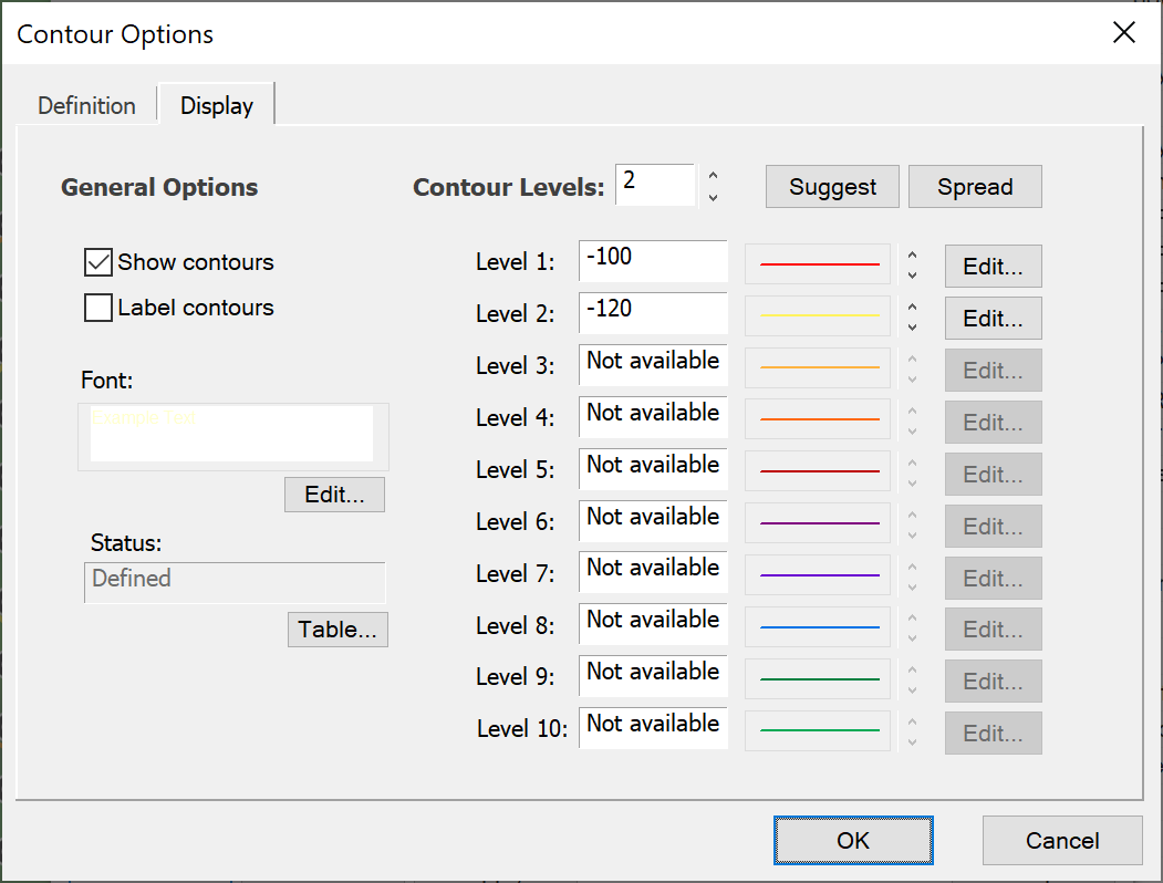
To make this form of contouring work you must:
- Create a grid of test points using the Station Group Service Area Wizard. This can define the service area by {Region, Beam footprint, or Country} but not {Locations or Hexagonal Cells}. On the final page the option selected must be to fill the area with stations in a grid defined by a number (North, East).
- For each of these stations create a link using the “Link to Station Group” Wizard. Often this is a Receive Link but it could be Fixed Link or even under some circumstances a Dynamic Link. However, it cannot be a Transmit Link.
- Configure the rest of the simulation including any other stations, links and interference paths.
Having done these three steps there will be a Link Group which has an associated station (either the start or end station) which is one of a grid of test points. It is therefore possible to associate a value from any of the link calculated values for each point on that grid and then contour it.
It is often useful to check that the values are as expected for one or two links using the standard Watch window.
When the simulation has been configured, it is possible to define the contours to display using the two dialogs above. This is done in two stages:
-
Define the Data to Contour
The data to contour is defined using the “Contour Definition” dialog shown in the figure above, and consists of:
- Select of group to use: this is usually a link group which have stations at one end that are in a regular grid
- Select whether to display a Station attribute (such as elevation or azimuth angles) or Link attribute (many of them, including C, I, C/I, C/(N+I), I/N etc)
- Select the object and variable from it to display: this is similar to the selection of a variable in the Watch window.
- Select the link direction (either Forward = Start to End or Return = End to Start) and then whether the grid of test points is the transmitter or receive station for the selected link direction.
It is also possible to define a minimum distance: this feature could, for example, be used to define a minimum coordination distance for Mode 1 or Mode 2 contours derived using RR Appendix S.7.
-
Define how the Data is to be Displayed
The contour levels and labelling is selected using the “Contour Display” dialog shown in the figure above.
This dialog is similar to the controls used to select beam or link levels on the view properties dialog.
Area Analysis vs Advanced Contouring
In general the Area Analysis tool is much more flexible and results in smaller simulation files that are quicker to load.
There are a few cases where it can be more useful to use the Advanced Contouring option. One is shown in the figure below, where by the grid of test points are all within the area defined by a polygon (in this case France) rather than a square that could include other countries or the sea.
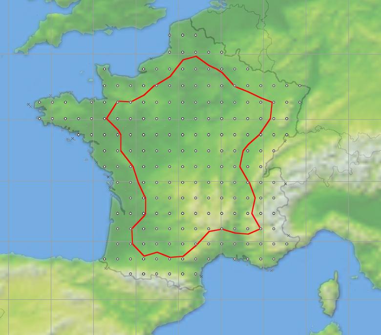
In this example a grid of test points with France has been used to generate a contour of locations where a 50 dBW transmitter at a height of 100 m would just meet a PFD threshold on the sea or land boundaries of France.