Priority Map
The Priority Map (PM) tool can be used to determine where one or more networks have regulatory priority over another set of networks. Priority is determined individually for each frequency band and polarisation.
The results can be used during the coordination process to try and get the best possible result for your systems during any negotiations. Having a clear picture of everybody’s assets is essential in these circumstances.
Launching
The Priority Map is launched from Visualyse GSO V3 by clicking the PM button on the toolbar or by selecting Priority Map from the Tools menu.
Alternatively, you can click your PC’s Start menu and select Priority Map from the Visualyse GSO V3 program group.

Defining the Analysis
When the Priority Map starts for the first time you will see the Main Screen.
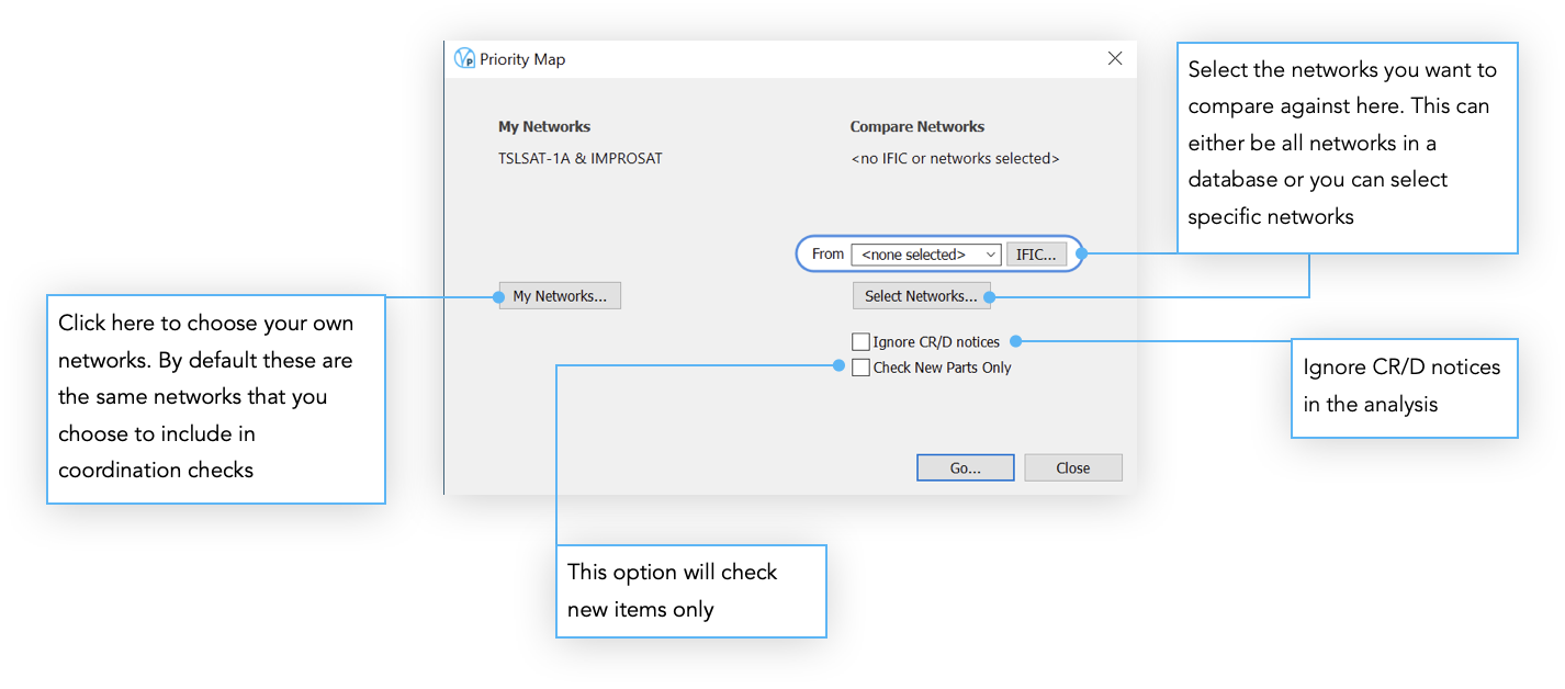
You’ll notice this window looks exactly like the top part of the new coordination check dialog. It works exactly the same too, the purpose being to select two sets of networks to compare

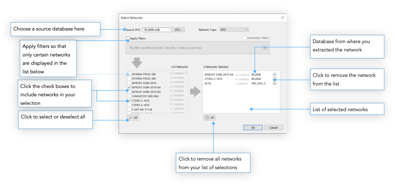
If you choose to select specific networks (by pressing the Select Networks button then the Select Networks dialog will appear. This allows you to hand pick a set of networks from one or more databases.

Results

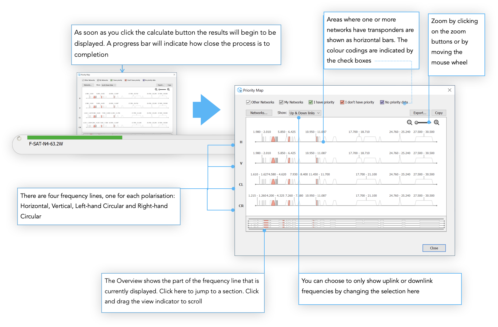
Areas where one or more networks have transponders are shown as horizontal bars. The bars are colour coded as follows:
White - only other networks operate here
Grey - only My Networks operate here
Green - My Networks and other networks operate here and My Networks have priority
Red - My Networks and other networks operate here but My Networks do not have priority
Blue - My Networks and other networks operate here but no priority data is supplied for either and so priority cannot be determined
Outputs
If you click the Copy button, a picture of the visible contents of the main window will be copied to the clipboard. This can then be pasted into a report.
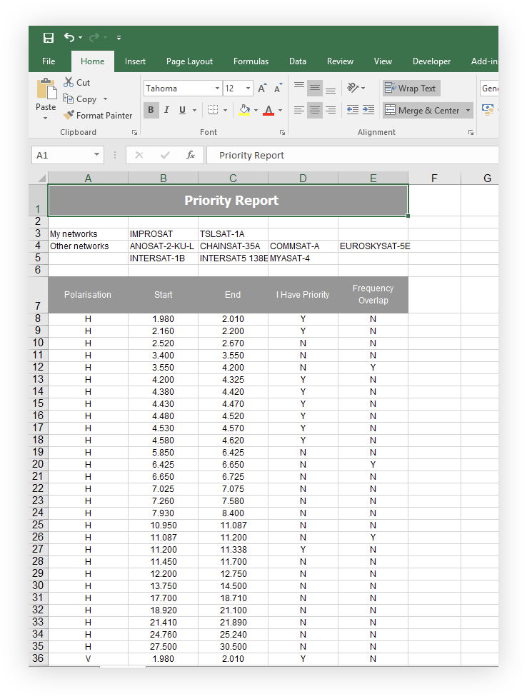
If you click the Export button, you can transfer the complete analysis to Microsoft Excel or a text file for further manipulation or analysis.
